Website Redesign Hub
Prototypes, branding kits, and identity concepts — all in one place
Prime Design & Built — Prototypes
6 conceptsMinimal Luxe
Clean editorial layout. Generous white space with refined typography. The work speaks for itself.
Bold Industrial
Dark, dramatic aesthetic. High-contrast elements with heavy typography and cinematic composition.
Warm & Organic
Earthy, inviting aesthetic. Scandinavian minimalism with Australian warmth and natural textures.
Kinetic Blueprint
Technical precision meets dynamic motion. Monospace type, animated grid lines, construction-in-progress metaphor.
Ember & Stone
Warm materiality with tactile textures. Limestone, concrete, and sandstone tones with golden-hour warmth.
Signal Tower
Bold editorial with massive condensed typography. Magazine-style layouts with split-screen hero and scroll-snap.
LK Design and Build — Prototypes
6 conceptsStudio Refined
Gallery-like aesthetic with gold accents on charcoal. Precision and sophistication in every detail.
Studio Animated
Full client website with scroll-driven project showcase and GGB-style technical infographic overlays. Studio Refined variant with animated Semaphore master suite feature.
Studio Motion
Scroll-driven video showcase. Cinematic bathroom pan controlled by scroll, followed by infographic reveal video. Studio Refined design language.
Industrial Blueprint
Dark CAD wireframe aesthetic with architectural annotations, scan-line animations, and technical spec cards.
Velvet Monolith
Dark, immersive, cinematic. Letterbox project views, gold particles, and curtain-pull reveals.
Architect’s Folio
Design journal narrative with chapters, staggered project grids, and a process timeline that draws on scroll.
Saturn Hire — Prototypes
6 conceptsBold Construction
High-energy construction brand with diagonal cuts, scrolling ticker, massive typography, and a masonry photo gallery. Built to make an impression.
Warm & Friendly
Approachable, inviting design for party and residential customers. Rounded corners, warm earth tones, conversational copy, and a helpful FAQ section.
Clean Trade
Professional white-background trade website. No gimmicks — real product photos, real specs, real testimonials. The trustworthy modernisation pitch.
Cosmic Modern
Modern redesign pitch with cosmic nebula hero. Real Saturn Hire content, services, and testimonials in a clean dark-mode layout with purple nebula gradients and star fields.
Deep Space
Cinematic scroll-driven reveal — close-up toilet zoom-out to majestic landscape. Cosmic “Saturn” brand play with orbital product naming, knowingly absurd.
Bush to Throne
Scroll-driven video reveal — construction worker behind a bush to a Saturn Hire toilet. Confident, cheeky tone with a before/after upgrade theme. Two animation options.
LK Design and Build — Complete Branding Kit
Seven final logo options in the shortlist. Select one to see its champagne asset, square and textured business cards, and launch it in any of the three prototype websites.
Logo Asset
Transparent Background


Solid Background


Favicon


Website
Champagne logos tuned for on-screen use — the tagline is faux-bolded for legibility. Used live on lkdesignandbuild.com.au.


Business Cards
2 formatsSquare Format
Matte black card, champagne logo & text
Textured Surface
Concrete / travertine / linen styling
Stationery & Documents
4 variants × 4 docsLetterhead, quote template, email signature and a sample drawing — each rendered in four colour variants of the approved Courier Slab mark. Pick the variant that matches the medium: charcoal for standard correspondence, champagne for dark proposal covers, mono for copier-safe output, two-tone for branded marketing stock.

Charcoal — Standard
White paper. Standard correspondence.

Champagne — Dark Premium
Proposal covers, dark presentations.

Mono — Black & White
Copier-safe, pure B&W print.

Two-Tone — Warm Neutral
Branded marketing stock, warm stationery.
Site Signage
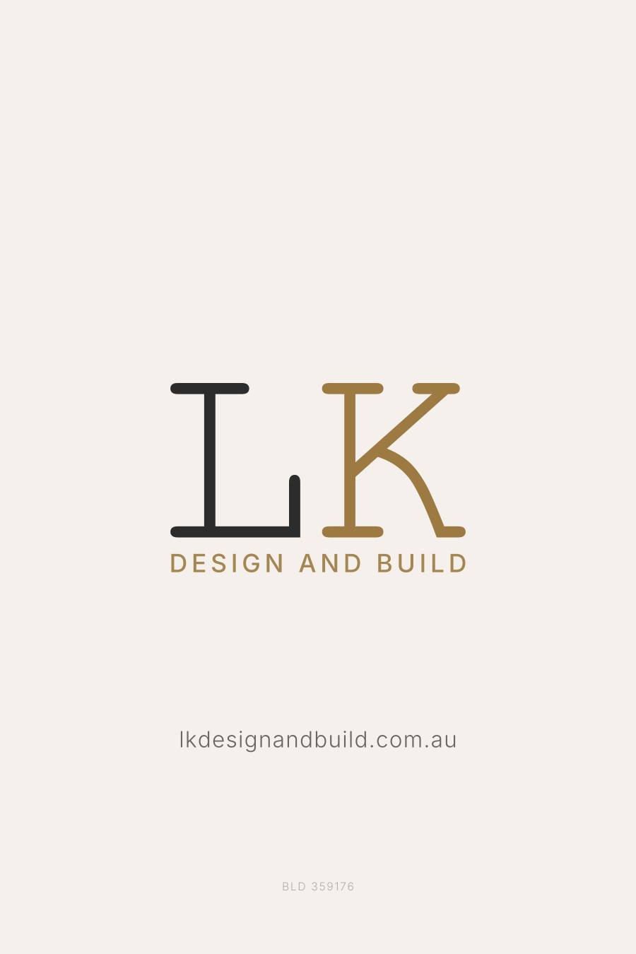
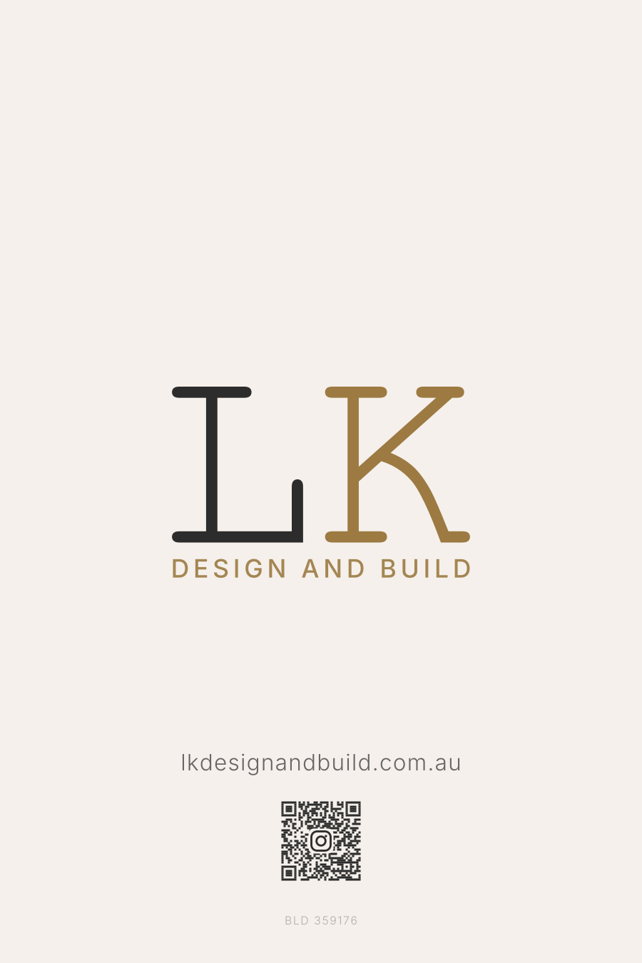
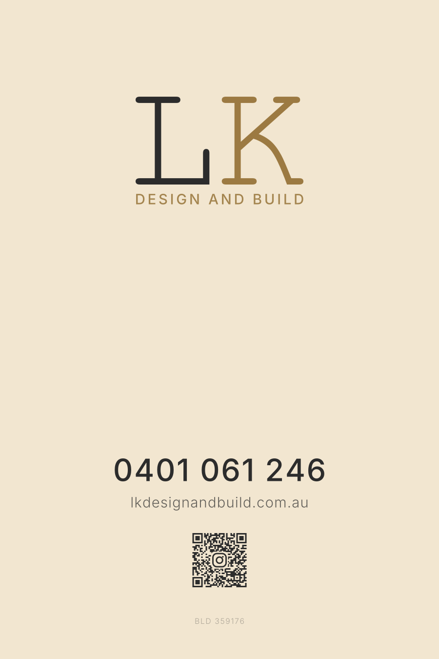
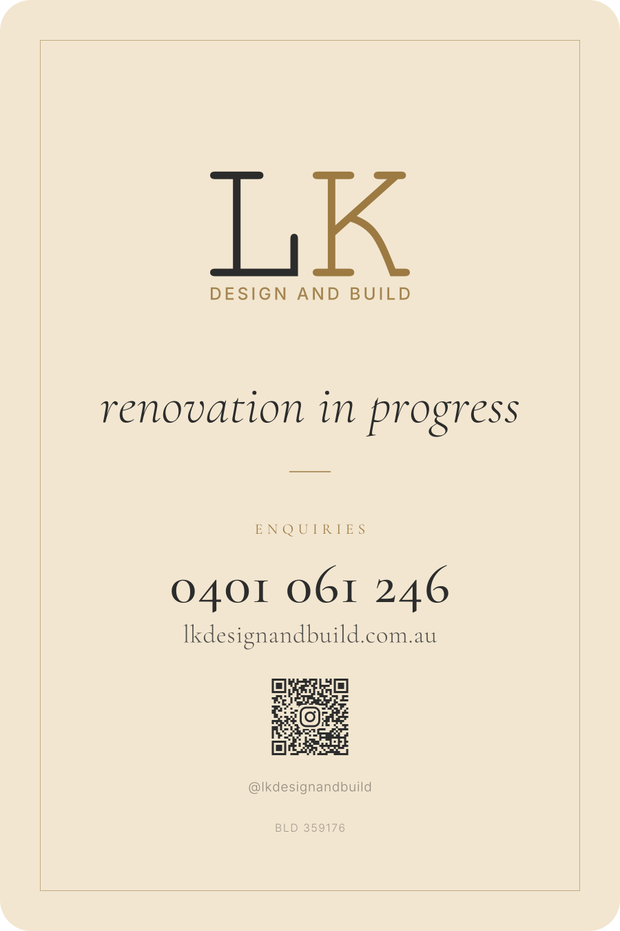
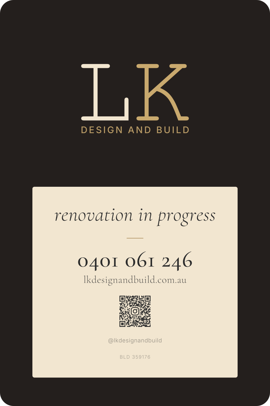
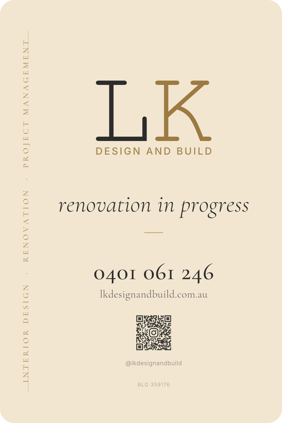
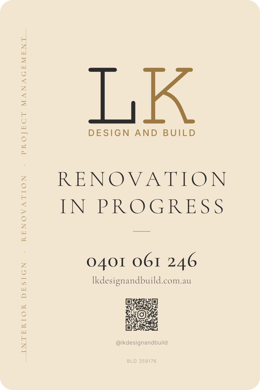
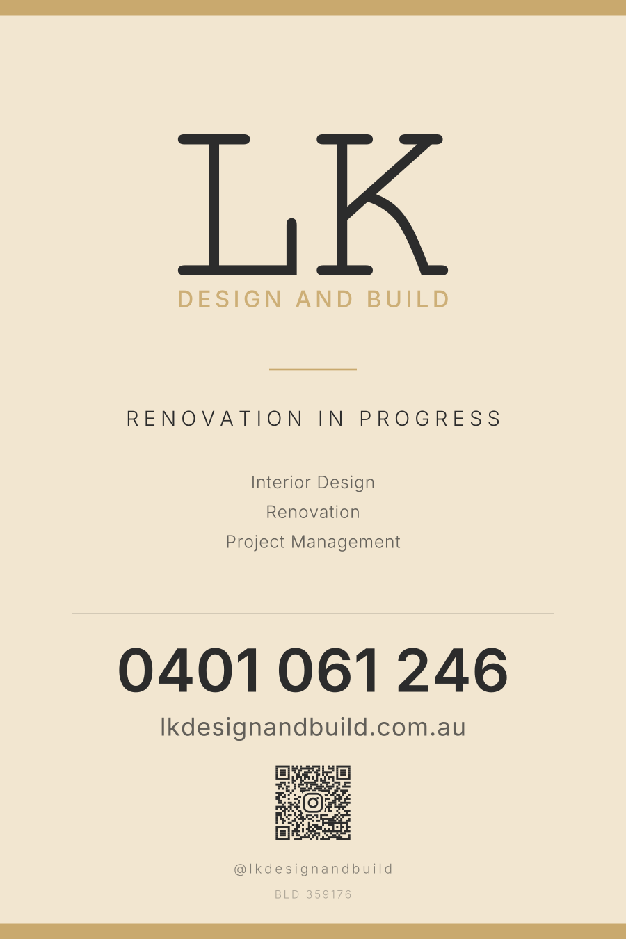
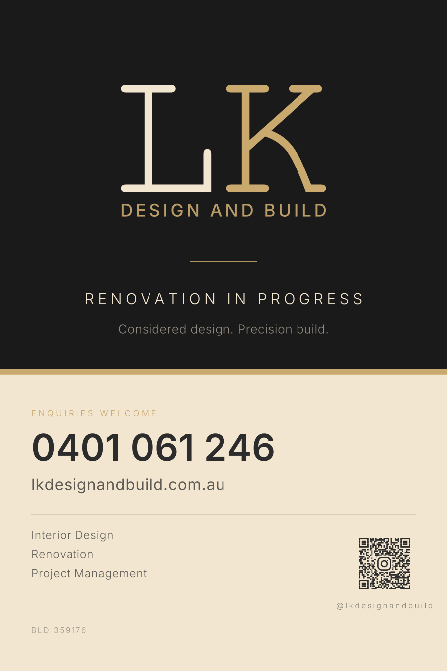
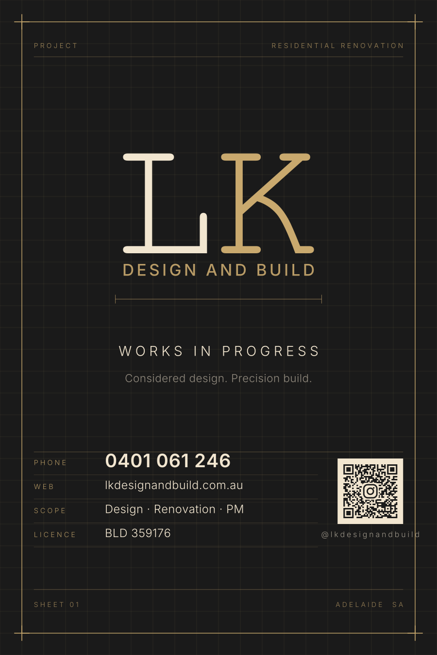
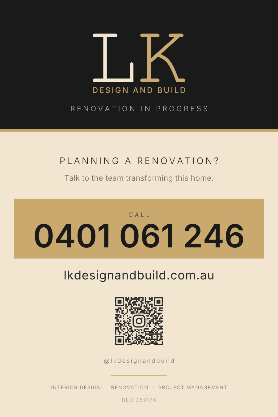
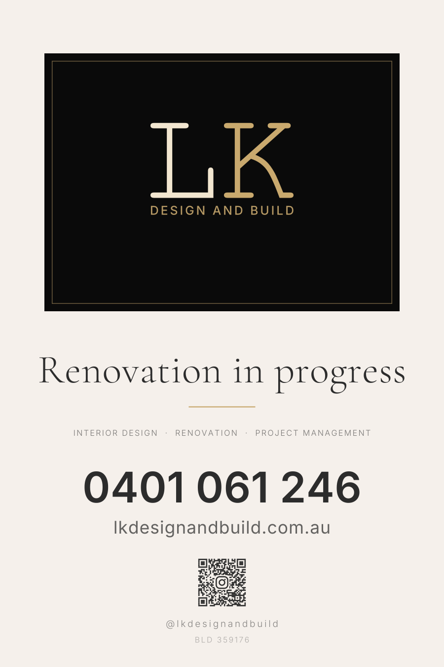
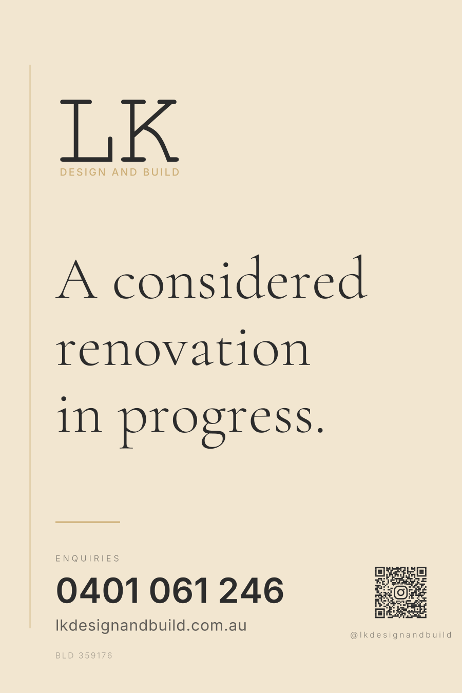
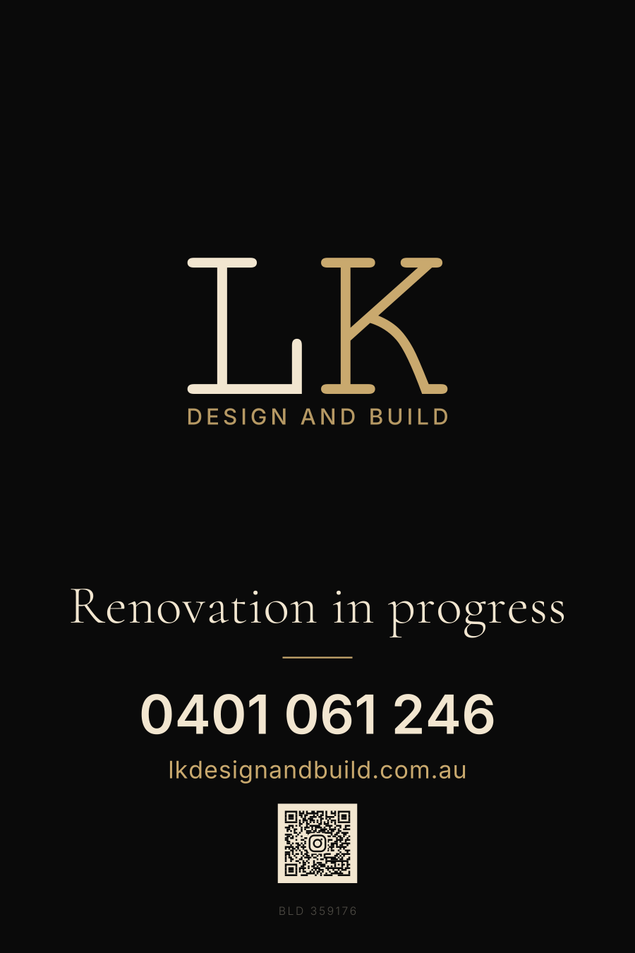
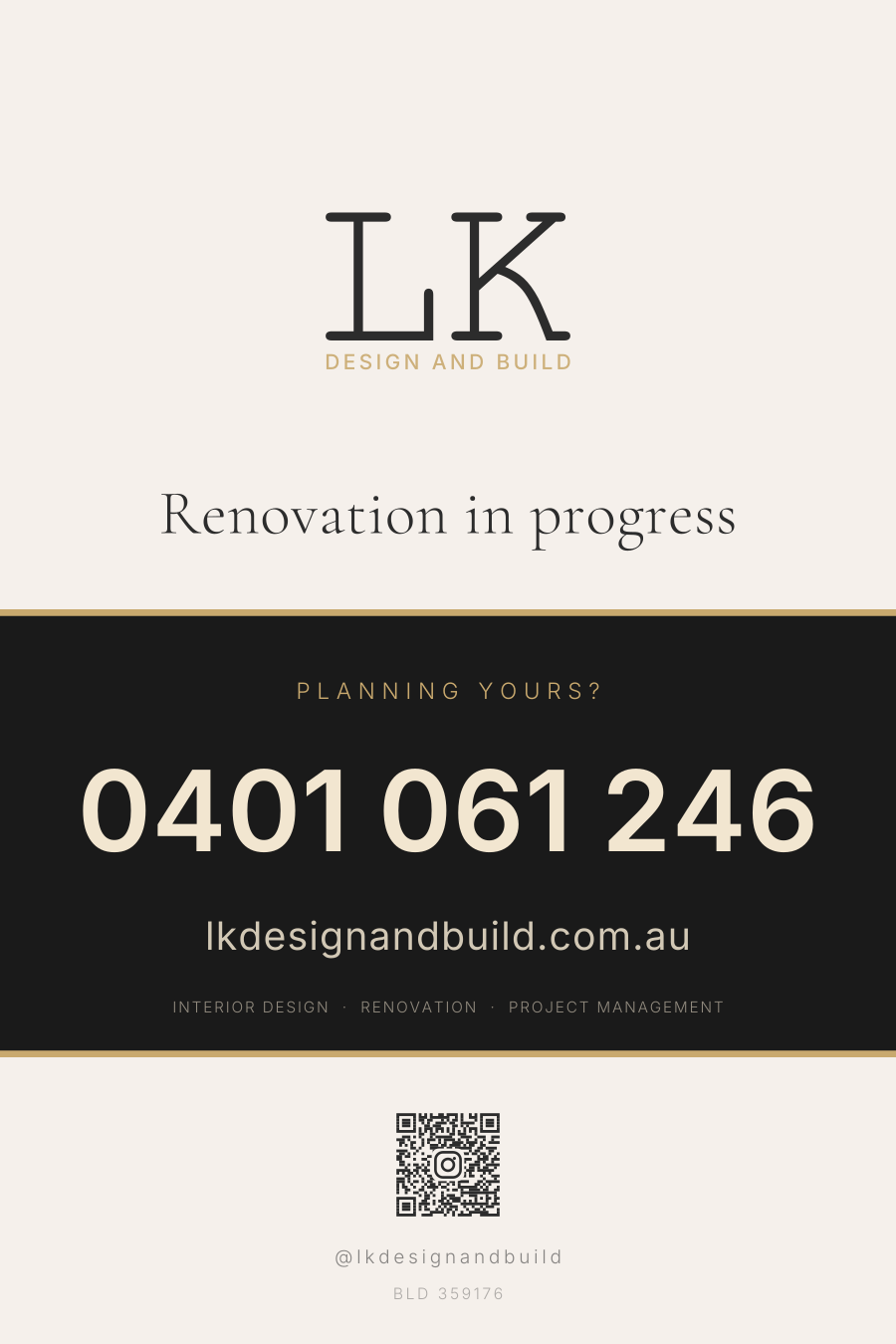
28 layouts × 2 QR targetsExternal panel for the front fence of a house under renovation: 400 × 600 mm portrait on 3 mm ACM. Every layout is generated from code rather than drawn by hand, so the lockup geometry is identical on all of them and a content change re-renders the whole set. Supplied as vector PDF at 406 × 606 mm with 3 mm bleed, type converted to outlines, nothing linked. Each exists twice: Instagram code or website code.
Simplest
Mark at the top, one or two contact lines at the foot, and a large void doing the rest. Each exists with and without a scan code.
Boutique
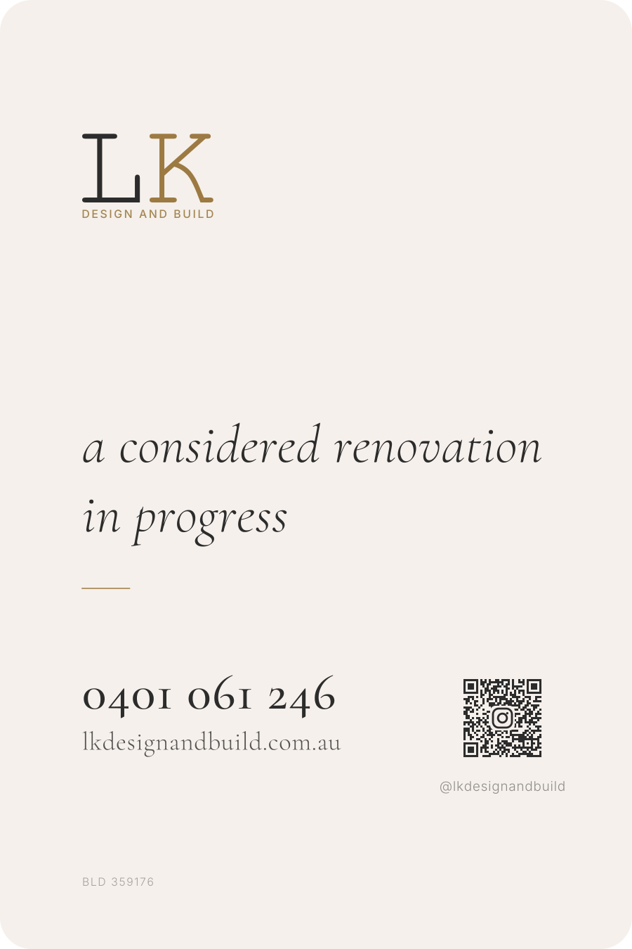
Asymmetry, a contained panel or a vertical spine instead of full-width bands, with the number set in Cormorant Garamond.
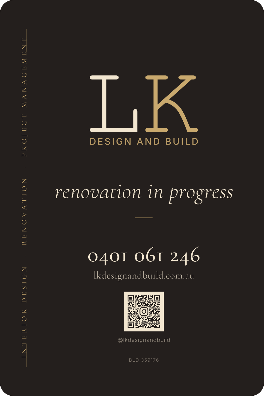
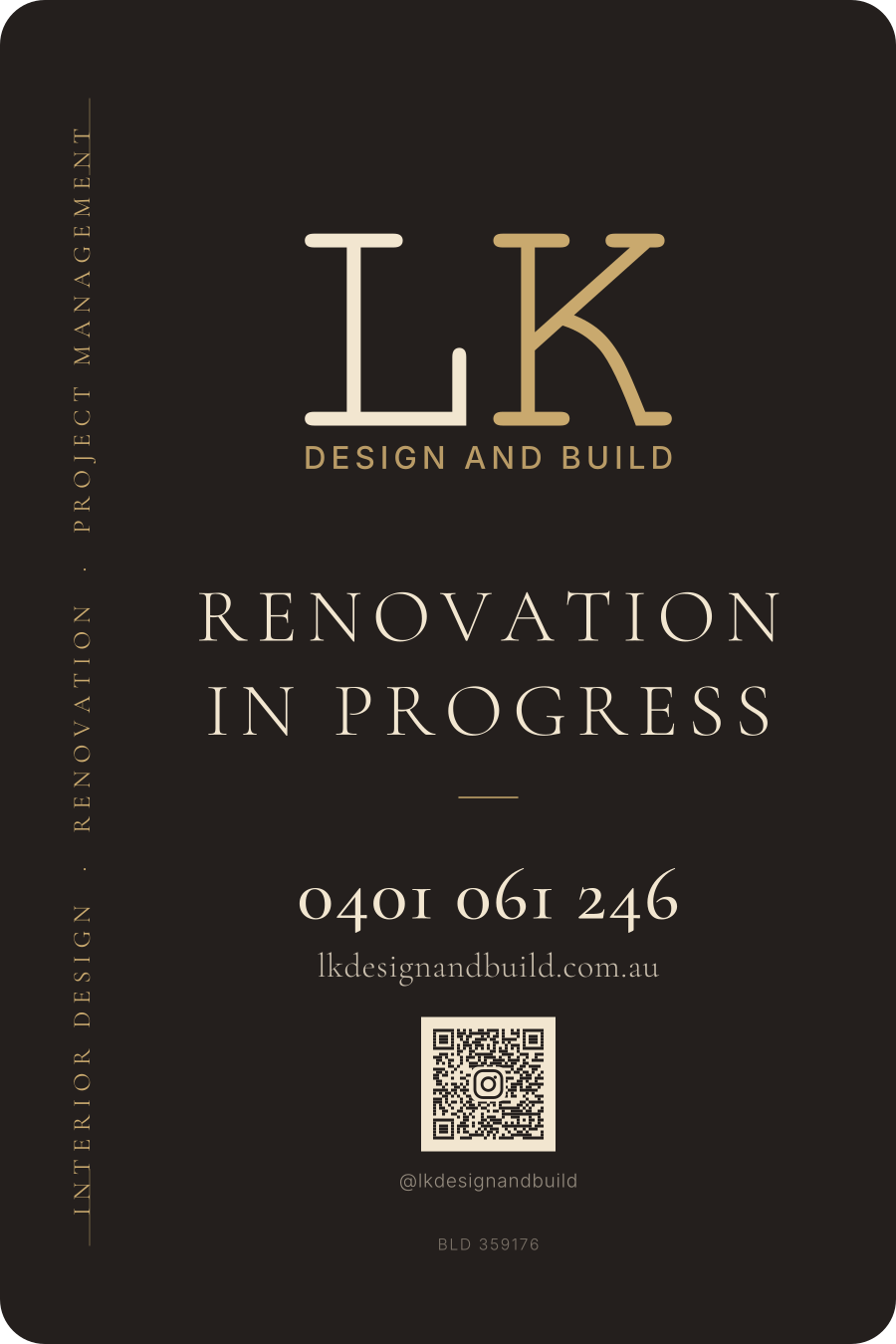
Softened
No frame, warm charcoal rather than near-black, capitals in Cormorant Garamond, and a 20 mm routed corner radius.
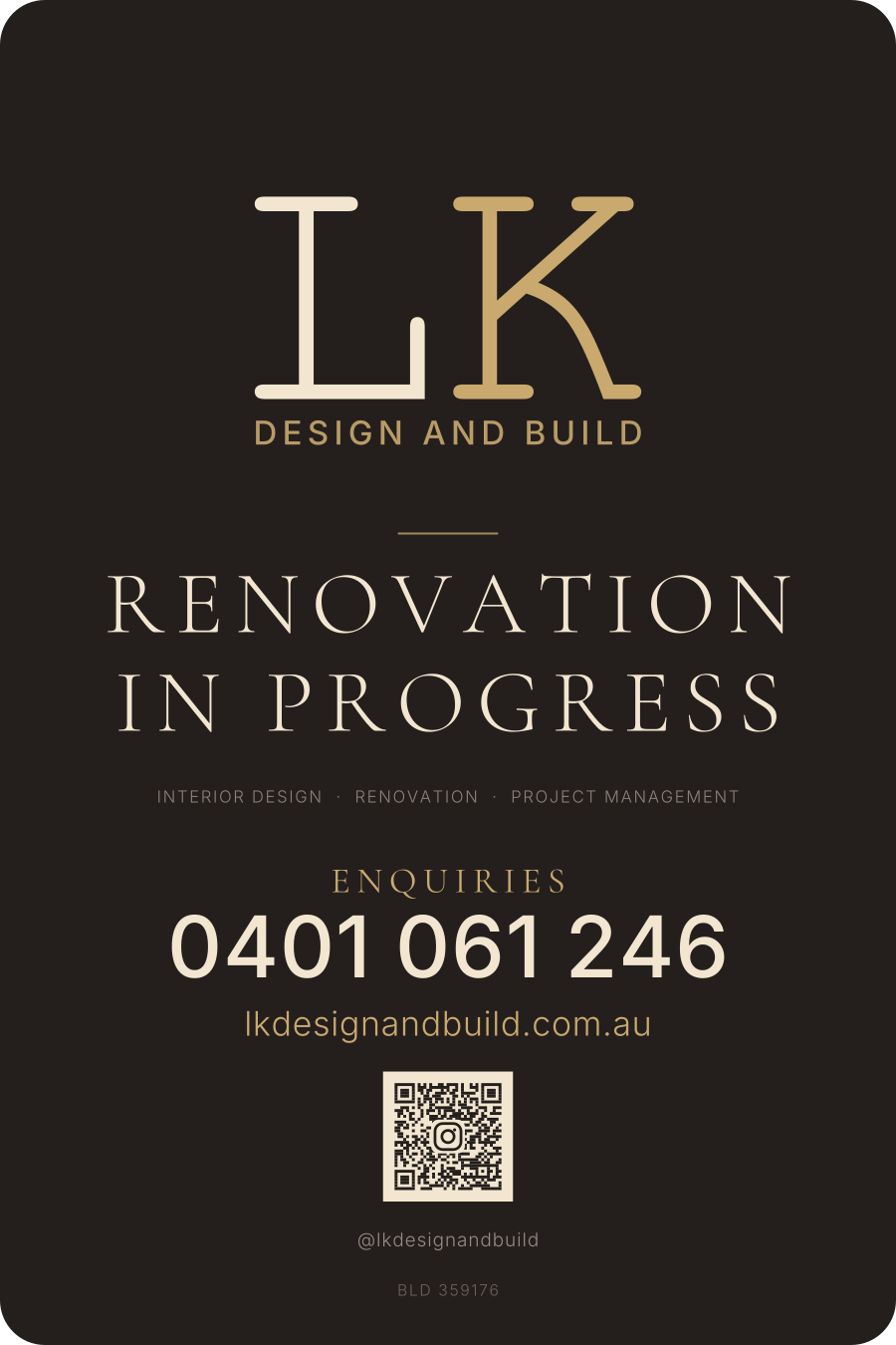
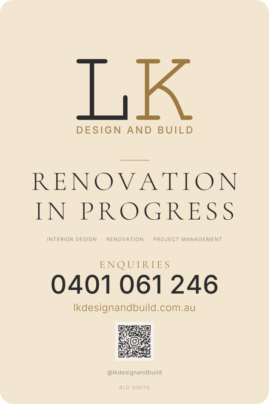
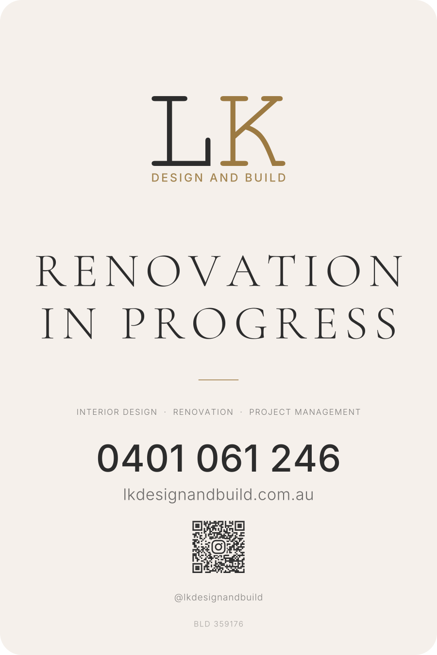
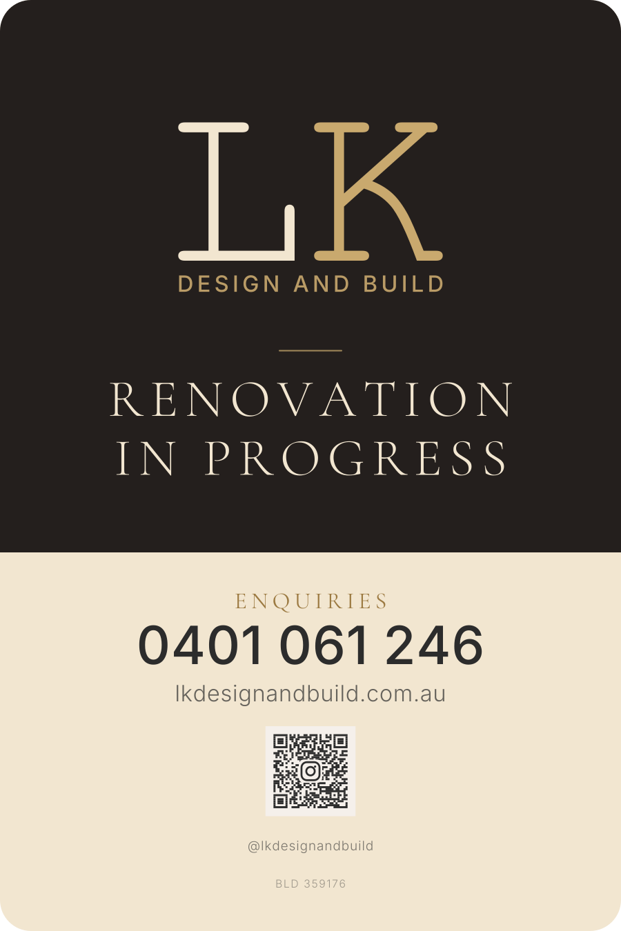
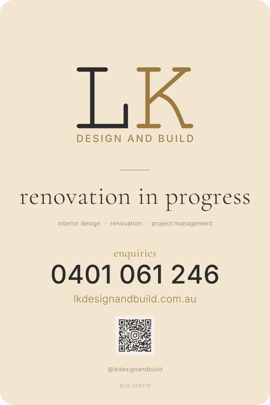
First and second pass
The original explorations: dark or light ground, brand-led or contact-led, and how much a passer-by actually needs.
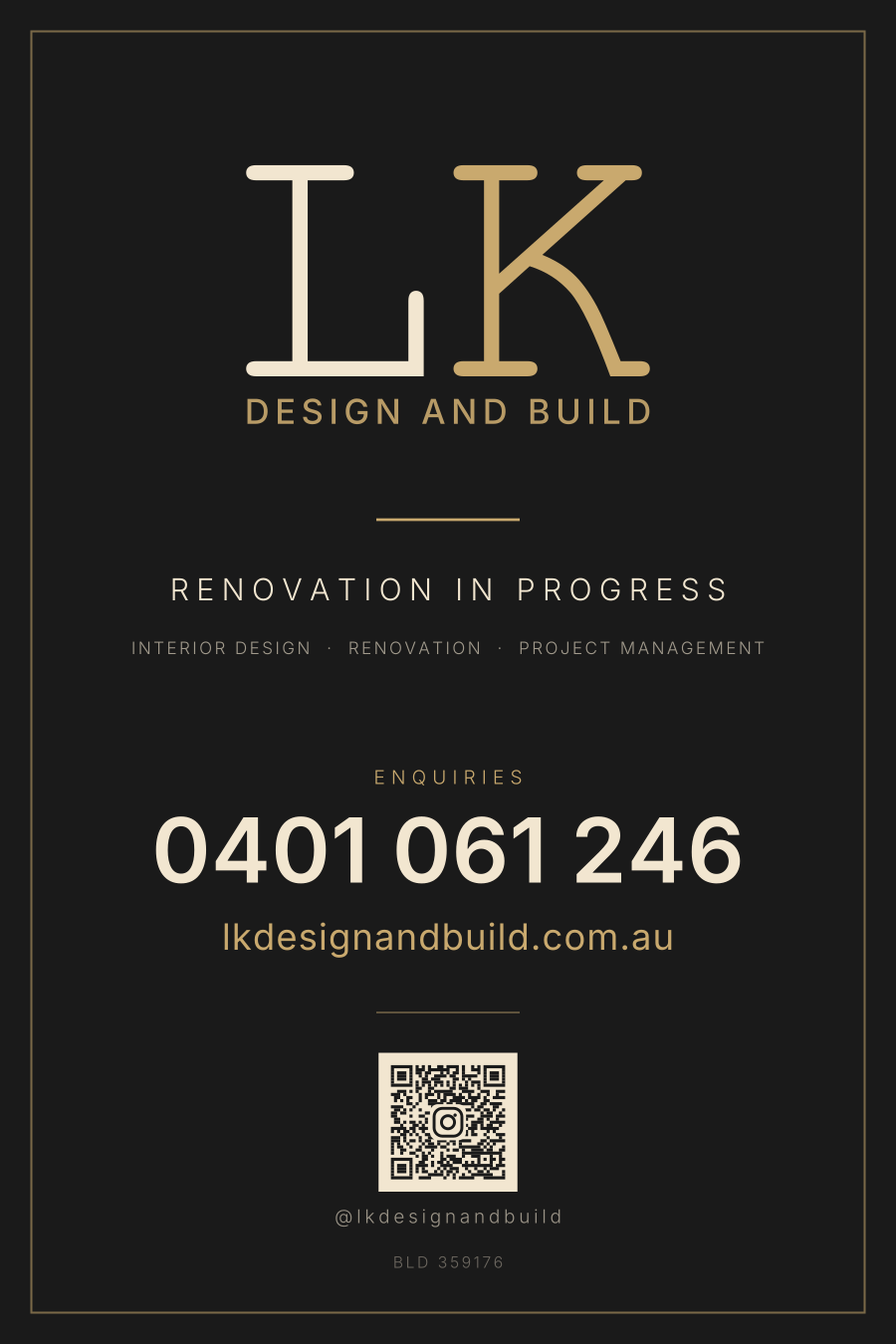


SEO & Social Share
Guidelines + starter OG imageRules for building lkdesignandbuild.com.au so it ranks locally in Adelaide and looks right when a link gets pasted into Messages, WhatsApp or LinkedIn. The starter Open Graph image is the 1200×630 card shown when the site is shared — use it on every page unless a specific page has a stronger hero photograph.
Meta tags, schema, local SEO, pre-launch checklist (.md)
 Open Graph Image
1200 × 630 · JPG · used for social previews OG Image Source

Editable SVG · re-export if branding changes
Preview on Site
Open the selected logo in one of the three prototype websites. Use the in-page Light / Dark / Dark Alt toggle in the prototype to preview colour variants.
Colour Palette
6 coloursTypography
2 fontsBrand Guidelines Summary
Brand Voice
Premium but approachable. Confident without arrogance. We speak to homeowners who value quality craftsmanship and thoughtful design. Warm, knowledgeable, trustworthy.
Logo Usage
Minimum clear space: 1x the height of the LK monogram on all sides. Never stretch, rotate, or recolour the logo outside the approved palette. Use icon mark below 40px.
Photography
Warm natural lighting. Show spaces in use — lived-in, not sterile. Emphasise materials, textures, and craftsmanship details. Avoid heavy filters or oversaturation.